 Ever take a photo, load it up into the computer, and then realize that the colors are off? You like the photo, but you're not sure how to get the colors right?
Have you ever noticed how catalogs seem to show all of their different color options using THE EXACT SAME PHOTO?
Or maybe seen a newborn photograph that appears to be completely in black & white - except for some cute accessory, like a tutu or hairbow - and then wondered how they did that?
It's actually pretty easy to get these effects using something called 'Color Mode' if you're willing to work on your photos in GIMP or Photoshop. (BTW, GIMP is a freeware software package that is VERY similar to Adobe Photoshop. If you are a business on a budget, I recommend using GIMP rather than shell out tons of cash for Photoshop.)
I'm going to show you how to use color mode to enhance product photos. You can use the technique to remove color from everything but your product, to get colorized images for marketing purposes, or to create color previews for your own custom catalog.
First: A Note About Monitors and Color
Monitors all display colors a bit differently from screen to screen too. Your monitor displays color as a combination of red, green, and blue light (thus the term "RGB"). Calibrating your monitor can help your computer sync how much red, green, and blue light it should be using for your specific monitor.
While you can't guarantee that your customer's monitor has been calibrated, you can at least calibrate your own. These two articles cover how to do that:
- http://www.digitaltrends.com/computing/how-to-calibrate-your-monitor/
- http://www.makeuseof.com/tag/5-online-tools-calibrate-monitor/
 |
| Painting tools like brush, fill, and rubber stamp usually change colors using the 'Normal' Mode, but there are a lot of other options. Color and Hue are found near the bottom of the drop down menu in Photoshop. |
Color mode is referred to as a blending mode in GIMP/Photoshop - in other words, it's telling the program to use a certain method for adding new information to your image. (In this case, it's color information, and with Color mode, you're telling the program to only change the color - the shading still shows through.)
There are actually many different types of blending modes. Usually, your tools and layers are set to 'Normal'. Each mode has its own properties, and some of them are suited for highly technical and advanced operations. GIMP and Photoshop both have most of the same mode options - though there may be one or two that are different between the two.
For this tutorial, we're going to be working with Color and Hue blending modes. Hue preserves more of the existing shading than color does. You may have to experiment to see which one is better for your specific application (more on this later).
 |
| Mode is set to color for this layer. (GIMP) |
 |
| The blending mode is set to Normal for the paintbrush here. (GIMP) |
Although you can use blending modes for tools*, I usually do not use color mode on anything but layers. It's just too easy for your hand to slip and mess up your original image. If you use a color mode layer, you can change the image with one click of the paint bucket/fill tool. Trust me, this is the most efficient way to get alternate color previews.
*Note: I will use blending modes for tools on occasion - just not color mode. For example, I find the Lighten or Darken modes to be really handy with brush tools. If you're using lighten mode, it'll only paint on the areas that are darker than foreground color. Likewise, if you're using darken mode on a brush, it'll only paint if doing so will make an area darker.
Let's say you have the following image of a little boy holding a basketball:
 |
| Cute little boy. But I want to highlight the ball. Lets get rid of some color! |
Step 1 - Create a New Layer
Do this by going to the layers window and clicking on the icon that looks like a piece of paper with one corner folded down. In GIMP, it's on the far right next to a folder icon. In Photoshop, it's next to the trashcan icon on the right.
Step 2 - Set The Layer Mode to Color
Look for the drop down menu near the top of the layer window that says 'Normal' and go down to 'Color'.
 |
| The second layer is in color mode and filled with deep blue. To do this, I first created a new layer, then changed the mode and filled it with a blue color using the paint bucket. |
Make sure the top layer (Layer 1) is selected. Photoshop highlights the current layer in blue. GIMP highlights the current layer in light grey. Then, use the paint bucket, or fill tool, to fill the layer completely with a color of your choice. You'll get a monochrome image.
You can change the color in Layer 1 as many times as you want. It'll change the look slightly. If you want the image to be black and white, fill the color layer with a colorless color (white, black, or grey will all work just fine). In this case, I want something that will contrast with the yellow ball, so I've filled it with blue:

Step 4 - Create a Layer Mask
You can do this in Photoshop by clicking on the icon that looks like a white dot in the middle of a grey rectangle. In GIMP, you can right-click on the layer. Fill the layer mask with white if it's not white already. Your main image will still look the same at this point, but your layers window will look something like this:
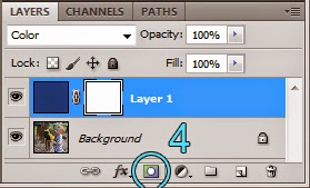 |
| In Photoshop, add a layer mask using the highlighted icon. In GIMP, you would right click on the layer and pick from the menu. |
Make sure you have selected the LAYER MASK, then go paint with black on the image over the ball. This will tell the program to apply that blue color to all of image except where you've masked it out with black. If you mask out too much, paint with white.

Since the ball is a circle, I adjusted my paintbrush to be the same size as the ball and made a perfect circle with one click. Then I painted white back over the fingers. Here's a shot of me working on making the fingers monochrome again with a bit of explanation of the process.
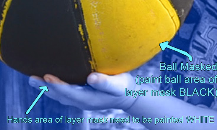 |
| Make sure the LAYER MASK area is selected when you paint in black and white. This will change which areas appear as monochrome. |

Step 6: Add Text (if needed)
Since this supposed to be a mock up of an add, you could easily use some of that negative space to add text. Here, I've generated some text to make this look like an advertisement. I used the eyedropper tool to select some of the yellow colors from the ball to use for the text for extra impact. I also decided to enlarge the canvas size, so I could fit even more text beneath it. The message does not appear in blue because I have moved the text layers to be above the blue color layer.

Now that I'm looking at this, I'd like to make some changes. Here's the same file, but with a white color layer instead of blue and a small change in the text. You'll notice the boy and playground are in black & white.

Variations On the Technique
Now that you've seen the basics of how this works, there is A LOT more you can do with it.
Gradient in the Background
You can easily change up the look of this photo by tweaking some of the layers. For example, here I've changed the blue color on the color mode layer to a gradient. If you look closely down in the lower right-hand corner, you'll notice that the text layers are placed above the color mode layer so they won't be affected by the layer. (Layers in blending modes only affect the colors underneath them.)

The red to greed gradient here is pretty obvious. Using two colors that are similar to each other (such as two shades of blue) will produce a more subtle effect.
Changing the Color of the Ball
Now lets say you want to change the color of the BALL. That's easy. Copy Layer 1, then click on the layer mask and press Ctrl+I. This will invert the mask so it affects only the ball. If both color mode layers are filled with the exact same color, the ball and the background will have the same color scheme. For this image, I've applied that same red to green gradient to just the ball (not how the layer mask on Layer 1 copy is mostly black). I've kept the blue color layer over everything else.

If you have really good eyes, you'll also notice that the text layers still exist - it's just I've turned off the little eye icons next to them so they don't show up.
On this image, I've turned off the blue color layer over the background area. The only color layer that is turned on is a purple layer with everything but the ball masked out. Although the ball is purple now, the color is a bit strong. (Although the ball is really black, the play of the light makes much of it a bluish-grey in the original image. Now that it's been changed to purple, it looks off.)

On the next image, I've changed the mode from Color to Hue. It preserves more of the black shading. I chose a really vivid purple on this image. If I wanted a less obvious color-shift, I could choose a different shade of purple and/or reduce the opacity of the layer. 
I could also adjust the mask a bit on the above image. If you look closely, you'll notice that there is a purplish highlight on the upper right portion of the ball. I'd really prefer to have that stay more black. There are two ways to deal with this. One, is to paint black on the image portion of Layer 1 copy so parts of it are black instead of purple. The other option would be to adjust the mask. I could do this by selecting a grey color and setting the paintbrush mode to 'darken' then paint over the parts of the ball I want to have less of a color shift (the black parts of the mask would remain black because the grey wouldn't darken them - thus I can tweak the mask without messing up parts I don't want to touch). Yes, you can also paint with a black brush set to less opacity, but I like having a set value of grey because then I can still easily go back to the original edge I defined earlier if needed.
For comparison's sake, here's the original, unedited image next to two other images using hue layers to change the ball colors. It's not too bad of a color replacement, don't you think? If I were selling basketballs, I could use these to show a catalog of the different color options without taking a gazillion photos.
 |
| Left: original; Center: blue layer in hue mode applied to ball; Right: purple layer in color mode applied to ball. |
Correcting Color Casts
If you read my article on How to Make An Amazing Item Look Awful (and how to fix it), then you may remember the white neckform that had a slight color cast on it. To remove the color from the completely white item, I used a white color layer over the neckform. Then applied a layer mask so I could see the original colors of the necklace.
 The bottom layer you has the original necklace photo. Next are two curves layers to correct brightness and contrast - one of them has a mask to correct for the fact that one side of the original image was brighter than the other. Layer 2 is set to Soft White mode and has 51% opacity, which makes the neckform seem whiter. Layer 2 copy is set to Color mode and has a 68% opacity to remove most of the color cast from the neckform. Layer 1 is set in normal mode and is used to make the background behind the neckform and necklace completely white.
If you take a photo of an item that is all one color, you can also use color and hue layers to correct the color of an item (like if that ball above was supposed to be purple). If you do this, you may want to lower the opacity of the Color or Hue layer a bit. The human eye has a good eye for whether or not there is any variation in the colors of an image.
GIMP Screenshots Of the Baby Cape
Up to this point, I've mostly pulled screenshots from Photoshop. If you would like to see this general process for GIMP, here are some screenshots that I took while creating the image for the title photo for the blog.
Here's the original photo in the GIMP workspace. The layers window is on the upper right, which is which is where you create a new layer.
 |
| Here is the original photo in the GIMP workspace. |
 |
| Image now has two layers. One in color. The second (top layer) is white and set to color mode. |
You add a layer mask in GIMP by right clicking on a layer and selecting 'Add Layer Mask'. From there, you're given several options for how you want that layer mask to appear. In this case, I'm picking white.
 |
| Right-click on a layer to Add Layer Mask. |
From here, I select the layer mask and start painting in black over the image. If you've selected the layer mask properly, you'll start to see the original color where you're painting.
 |
| See how black is starting to show up on the layer mask thumbnail? The same areas are getting their original colors back in the image. |

I took this shot with a lot of negative space left of the child, which makes it easy to add text if needed. However, I wanted a vertical shot for this blog (because vertical shots show up better on Pinterest), so it needs to be cropped. This last screenshot shows which portion of the image I chose to keep. From there, all I needed to do was add text.

Can you think of any applications where you might be able to use color mode on images for your business?
Wow! What a detailed tutorial! I don't use GIMP or Photoshop, but if I did, I'd definitely have this post bookmarked for future reference. Thank you for sharing, Michelle.
ReplyDeleteThis comment has been removed by the author.
ReplyDeletethis was a duplicate post
DeleteYes, it was. I didn't realize it would show up quite this way when I was working on the backend of the blog.
DeleteYour tutorials are always so detailed and easy to understand. I've not used either of those editing tools, but when I am ready to expand my photo editing skills I will have to refer back to your tutorials!
ReplyDeleteWhat a thorough explanation, Michelle, wow, thank you for your generosity and spending so much time in writing detailed tutorials.
ReplyDeleteI think this tutorial is beautifully made with many clear images to show the different steps. I think it's great that you include gimp too since that is a more powerful program than some people realize, and it's free too!
ReplyDelete